What has science got to do with design?

What has science got to do with design?
It is a belief held by some that art is art and science is science. And never the twain shall meet.
This, obviously, is a complete and utter fallacy. Indeed, to create good design – to create design that works – science has to play a role. Whether it is how we respond to certain colours, how we interpret certain words or how we interact with the world.
Now, design is not just something we do to make things look pretty. When combined with business and marketing, it becomes a tool to increase conversion rates and ROI.
Is there a way to increase conversion through design?
And this is where science starts to play a role in design. Using studies and research in areas such as cognitive psychology, biology and sociology, designers are able to create adverts, websites and print that can increase conversions.
Ever noticed that all e-commerce websites look similar?
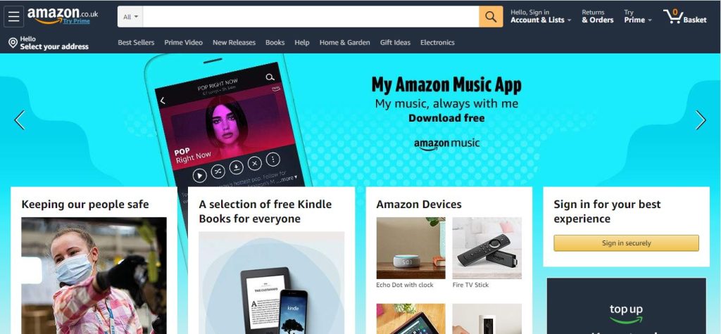
Amazon website.
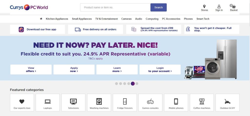
Currys PC World e-commerce website.
It is not a case of web designers being lazy. Actually, the complete opposite. A good web designer will know the principle of Jacob’s Law.
Jacob’s Law follows the principle that:
‘users prefer a site that works in the same way as all the other sites they use’
E-commerce follows this law because it helps users orient themselves. You instinctively know where the basket is. You instinctively know where to find products. And this instinctive reaction ultimately has a positive effect on the conversion rates of an e-commerce website.
Through e-commerce websites, we can see how science has an impact on design. But what if you don’t run an e-commerce website? What other laws of design can you apply?
How we format information on a website and use that in design is an area called Information Architecture (IA).
Grouping (or chunking) is an area of IA that will make the content on your website easier to digest for the user. But what is it all about?
It’s all about human memory.
Back in 1956, cognitive psychologist George A. Miller released a paper in Psychology Review entitled “The Magical Number Seven, Plus or Minus Two: Some Limits on Our Capacity for Processing Information”. This paper has since become one of the most highly-cited papers in psychology.
Miller’s work was looking at what the memory-load of the short-term memory is. His research identified that people typically only retain a limited amount of information. The ideal number was found to be 7, plus or minus 2. This gives a range of 5 to 9 pieces of information. This has become known as Miller’s Law.
The biggest problem with Miller’s Law is the way it has been interpreted in design, particularly web design.
Many have taken the Law to mean that you should only display 5 to 9 pieces of information. But this is not always the case!
The best example to show Miller’s Law in action is something we all do naturally with phone numbers.
Our company phone number has 11 numbers in it. Clearly too many numbers, if Miller’s recommendation is taken literally.
01522303100
But who writes a phone number like that?
We all break it down:
01522 303 100
Now whilst we still have 11 numbers overall, we have broken it down into 3 separate groups of information. Doing this makes it easier to manage and easier to remember.
This is the direction that Miller was trying to take us in his findings.
That by grouping information together, we find it easy to store in our short-term memory.
Grouping
So, grouping in design is about formatting content in a way that makes it easier for the user to digest and retain that information.
Miller’s Law implies that our short-term working memory is limited. And we need to design with that in mind.
Grouping enables us to break up large pieces of information into more easily manageable pieces. This makes content less overwhelming and easier to read.

Take web pages that need lots of information as an example. Ideally, at the span of every 250 to 300 words you want to introduce a ‘breaker’. This helps break the content up further. Breakers can include:
-
- Subtitles
-
- Blockquotes
-
- Bullet points
-
- Bold text
-
- Images
But doesn’t this create longer web pages?
There is no denying that grouping your content and adding breakers does indeed create longer web pages. But this is not something to be wary of.
Take for instance the rule that most people do not read all the content on a web page. Breakers, therefore, serve the purpose of keeping their interest whilst they scan read to find content that does interest them, as well as making the relevant elements easier to remember.
Grouping also allows your users to stay focused and engaged. When employed correctly, your users will naturally scroll. They may not take in all the information, but they will take in what is relevant and important to them.
Reducing decision-making time
Another valuable concept, Hick’s Law, states that the more options you provide an individual, the longer it will take them to make a decision.
It sounds like an obvious thing, but it is something that is incredibly important to UX and web performance.
Narrowing your focus to reduce the options available to your users will help them choose to take action faster.
Sometimes it is not possible to reduce the number of options available to your users though. Typically, this can be seen when it comes to listing things like product features.
In these instances what can you do?
This is where Hick’s Law and Miller’s Law combine together.
Instead of reducing the number of “features” listed, you group them together. This creates smaller, more digestible lists and the feeling of less content. This makes it easier for users to read, understand and remember the information in front of them.

The initial ungrouped list features 18 items. As we have previously discussed, this makes it complicated and difficult for people to read, pick out what is relevant to them and remember it. This, therefore, increases the time spent making a decision.
By grouping the list into relevant smaller lists, we’ve now made just four categories which is easier for the user to read and digest. They can also choose to skip to only the categories that are relevant to them and consume (and remember!) all the items within it.
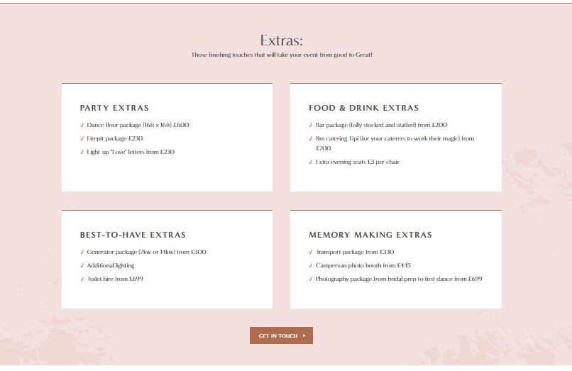
This practice was recently applied by Team Epix for The Tipi Tribe website, whereby all the package extras are broken up into relevant categories. This makes the lists easier to consume and understand by the user.
What steps can I take?
Design is not just how things look, but how information is presented.
Breaking up, grouping and formatting content so that it is easier for your users to read, can boost the performance of your website. Whether that is through increasing time on page or gaining more conversions.
Review your website. Can you use grouping to improve features lists, break up content, or make your navigation more effective?
Ready to get started?
Our team of creatives work together in a wide range of disciplines, meaning we’re able to craft beautifully bespoke creative that will produce results you’ll love!