Rules of logo design: What makes a good logo?
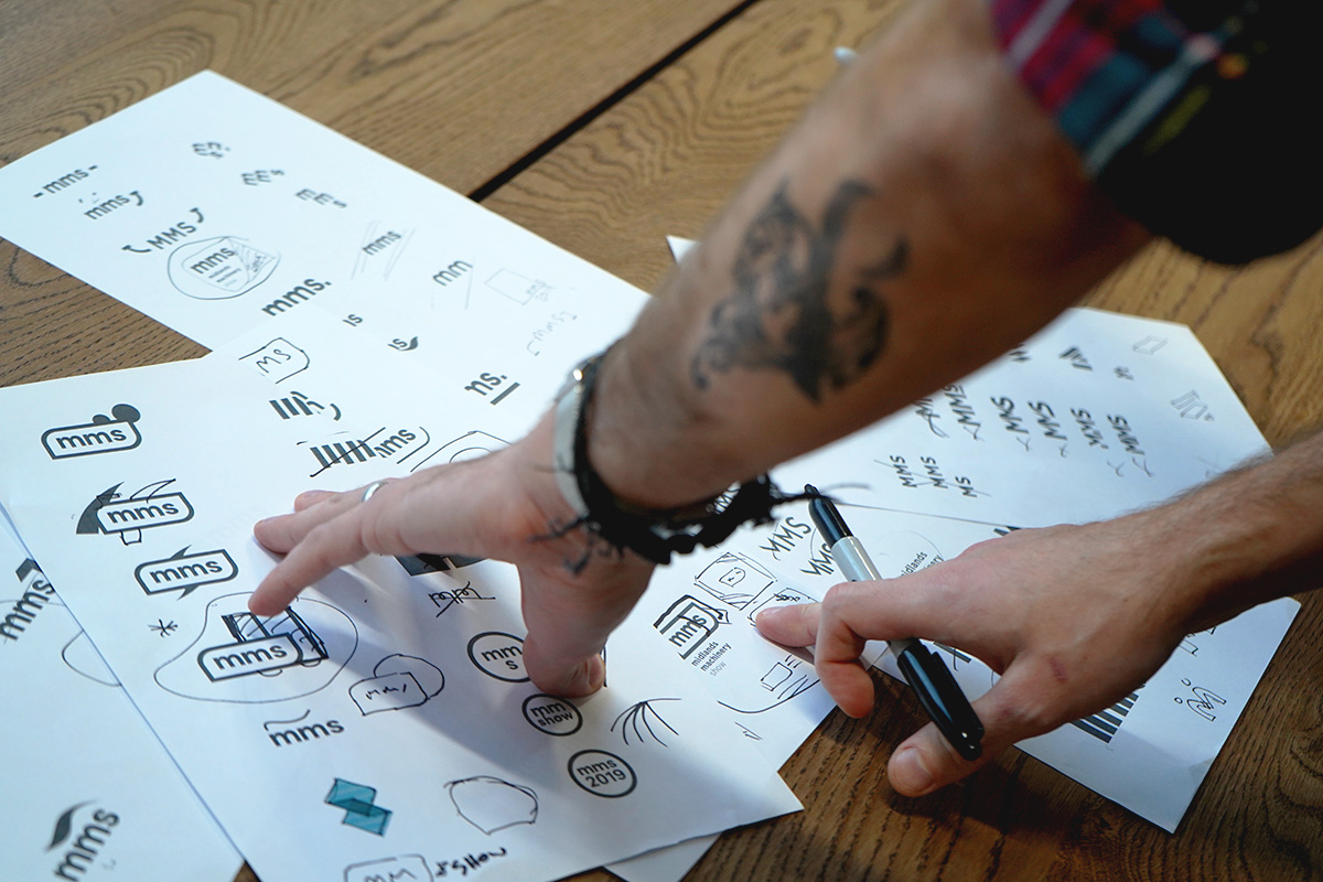
Logos are incredible, powerful pieces of design, a central part of its most valuable asset: its brand.
Logos represent an organisation across print material, clothing, signage, websites, videos, and social media.
With just a simple glance at a logo, you can recall a range of ideas and feelings about that business offers, what it stands for.
Think of the logos of some of the biggest brands in the world; Apple, Coca-cola, Amazon, McDonalds. Their logos have transcended design and become the mental signpost to a world of associated ideas in your mind.
But what’s the secret of a good logo? Are there rules of logo design that the strongest logos follow?
Turns out there is!
Rule #1: Does your logo reflect your company?
There is an important distinction to make here.
A logo needs to reflect the business. But it does not need to literally represent what the business does.
This is a trap that many businesses fall victim to. They feel that for their logo to reflect their business, the logo needs to ‘show’ what the business does.
This is not the case.
Think about it. Does Apple have a computer in their logo? Does Mercedes-Benz have a car? Does Nike have trainers?
No, they don’t.
But their logos still manage to reflect their companies.
How do they achieve this?
Admittedly, part of it is having multi-billion-dollar marketing budgets, and using consistent messaging around a set of core brand values when they advertise. Communicating those ideas over and over again.
But there are some simple design rules that can be used to achieve certain perceptions. Take fonts for instance.
A business that wants to be perceived as a timeless, professional company with a long history might want to use a Serif font because they conjure up ideas of heritage.
Meanwhile, if a business wanted to present itself as a forward-thinking, futuristic brand, it would want to opt for a clean looking Sans-Serif font because they feel modern.
![]()
And this is just the tip of the type iceberg. At Epix Media we often work more deeply on fonts, customising them to create logos that are truly unique.
Applying simple rules like this can have a drastic impact on how a business is perceived.
Think about your company. What values do you want people to feel when they notice your logo?
Rule #2: Avoid having too much detail
Complicated logos introduce problems (one of which we’ll cover further down). But one of the biggest is that they require too much attention.
“But James” I hear you say, “I want people to notice my logo!”.
Sure. But consider the long game.
People need to be able to perceive the logo quickly so they can recall the brand values (mentioned in the first rule) almost instantly
And too much detail in a logo means it takes longer to perceive. If it takes too long to perceive, people simply skip over the logo and don’t engage with it.
Alternatively, a logo that is composed of simple, clean, lines and minimal styling works a lot better at drawing the eye and being instantly recognisable.
You will notice this pattern again with some of the biggest brands. Many have evolved their logos from having plenty of detail to much simpler designs
![]()
![]()
![]()
![]()
![]()
Rule #3: Black & White (aka Mono Logos)
Colour is obviously an important aspect to a brand. Colour provides distinction, personality, energy.
One big question often considered when creating a logo is what colour the logo should be.
You might be surprised to learn that the colour of a logo is the very last step of logo design.
So why is this?
Well, there’s a simple philosophy at play here:
A logo represents a business. But unfortunately, no amount of brand decks will give complete control in how the logo is presented.
Take for example this scenario. An email gets invoiced to a client. The logo, obviously, takes pride of place in all its technicolour glory. Unfortunately, the client only has a black & white printer so when printed out, the logo just looks a bit of a mess.
Even though it is slight, the brand presentation has taken a hit.
But this issue can easily be resolved.
By designing the logo in black & white first, the designers introduce an element of flexibility into how the logo can be presented.
Going back to some of the biggest brands: see how they are still recognisable when shown in just black and white?
![]()
There can also be a cost-benefit to this. Printing a logo in four colour process can cost more than a single colour, so if your logo has been designed first to work in black & white, can sometimes be printed more cost-effectively. This can be useful for letterheads, notepads or embroidery pads for example.
Rule #4: Is your logo easily scaleable?
I mentioned earlier how having too much detail in a logo can introduce problems. Scalability – how the logo looks at different sizes – becomes an issue when the logo has too much detail.
Today, the scalability of a logo is more important than ever.
Traditionally, the rule for logo design was ‘business card/billboard’ – Will the logo look good on something as small as a business card or as big as a billboard?
But these days designers have additional challenges. Logos also need to meet the requirements of social media platforms.
Take Twitter for instance. A profile picture on Twitter will show at 200 x 200 pixels. That’s about half a centimetre. Smaller than anything you would want to ever put on a business card.
A detailed logo will look like just a jumbled mess at that scale.
As a result, business have two options:
• Ensure their logo works at such a small scale; or,
• Develop a ‘responsive logo’ that the alters the presentation of the logo at different scales.
Responsive logos are a growing trend. You may see responsive logos being used by brands with icons in their social media profile pictures.
![]()
Rule #5: A good logo should feel balanced
This rule is a lot tricker than the others to implement and requires a trained eye to achieve.
A balanced logo is pleasing and appealing.
But how do designers achieve a balanced logo?
They try to ensure that the “weight” of the graphics and sizes of the logo are equal on both sides.
No one part of the logo should overpower the rest.
It does not necessarily mean that a logo should be symmetrical. Balance can be achieved through clever use of spacing, priority and hierarchy.
![]()
Remember, a logo needs to be instantly recognisable at a glance. Businesses do not necessarily want viewers to ‘read’ the logo, but to ‘know’ the logo – to be able to see it and instantly know who the company is.
An unbalanced logo impacts how people perceive it. They won’t feel like it’s pleasing or appealing.
Balance is another subtle but important tool in making logos powerful.
———–
Our tip for marketers and brand managers is to keep on top of how the audience are perceiving the logo and wider brand. Track any changes in perception and keep assessing those perceptions against the wider business plan. That’s one of the key tactics in maintaining relevance.
Also, keep an eye on competitors. In some markets, competing businesses’ brands can converge and start to look similar. When this happens, there’s low distinctiveness and it can be harder for customers to differentiate. That’s the point when a logo redesign can create new attention and help you break away from competitors.
The five rules above are essential when designing a logo that’s recognisable, powerful and valuable!
For more insights on creativity and marketing, sign up to our eshot, or take a look at our other articles.
Ready to get started?
Our team of creatives work together in a wide range of disciplines, meaning we’re able to craft beautifully bespoke creative that will produce results you’ll love!